Remaining vertical space
Filling the Gap in Vertical Space Left by the CSS Specification and Current Browsers
Patrick van Bergen | First published: April 22, 2006 | Last update: May 18, 2006
Assumptions
- XHTML 1.1
- IE 5+, Firefox 1.5+
Links

This page is best viewed with IE5+ or Firefox 1.5+
Websites are changing from being page-oriented to being window-oriented with the coming of single-page user interfaces. This also means that browsers are expected to create pages that have specific vertical size requirements. This article deals with a specific demand: that of being able to fill the remaining vertical space of a box from some random location to the bottom. Take the webpage you are looking at for example: the header is taking up some unknown amount of vertical space, depending on the width of the browser window. The rest of the window is taken up by the content. The title is available at all times while you read and scroll through the text. A valid and useful layout.
Not possible
Of course I tried to solve this layout problem using standard CSS first, checking many sites dedicated to that purpose. Unfortunately, this layout is not possible with currently available browsers, nor is it possible according to the CSS specification. The current specification is actually quite specific at this point, and even gives an equation and an algorithm to calculate box heights. The section I mean is CSS 2.1, section 10.6.4 Absolutely positioned, non-replaced elements. It does not allow an element to take up the remaining space. It is interesting to see that the height calculation in version 2.0 of the specification (which is still the latest W3C Recommendation at this point, though not for long) was completely different in this respect, and allowed it easily. Apparently current standards-compliant browsers follow version 2.1.
Hacking
But what if you needed to have such a layout, anyway, at least for Internet Explorer and Firefox?
It is possible to simulate this layout using a Javascript onresize event-handler, but it is a lot of work, it's slow and not completely accurate.
I could not get the idea out of my mind that this was such a simple thing that it just had to be possible in any self-respecting browser. Especially since such a thing has always been available for table-cells and frames.
Internet Explorer
I was first lead to a possible solution for Internet Explorer by a message on Experts-Exchange by Lawrence J. O'Sullivan (ljo8877) who wrote:
Try this:


#parentBox {

   position: absolute;  /* or relative  if that fits your design */

   height: 300px;

   width: 500px;

   overflow: auto;

   border: 2px solid #000; margin: 0 auto;

}

#childBox {

  position: absolute; /* is positioned within the containing positioned parent block */

  top: auto; /* where it would be in not positioned  in FF and others */

  top: position-static; /* IE equivalent to auto */

  bottom: 0px;     /* Pulls box to bottom in FF */

  height: expression(this.parentElement.height - (this.offsetHeight + this.clientTop) );

  /* sizes for IE */

  background: #CCF;

}
What is new here (for me) is the way height is calculated. Height is a dynamic property formed by a Javascript "expression" that calculates the height of the child element by subtracting the current normal flow position (relative to the direct parent) from the height of the parent. However, somehow this exact formula didn't work for my purpose, so I played around with it somewhat. I then came up with the following simple solution:
					position: absolute;

					top: auto;

					height: expression( this.offsetParent.offsetHeight - this.offsetTop );
This works wonderfully well. I presume dynamic properties may solve many more style problems. They also allow the creation of an entire application in a stylesheet but that's probably best left as an interesting thought experiment :)
This expression formula is only an approximation, however. I have drawn a picture of the actual measurements Internet Explorer uses in standards mode. It shows the child element inside it's parent element, including paddings (in purple), borders (in blue) and margins (transparent):
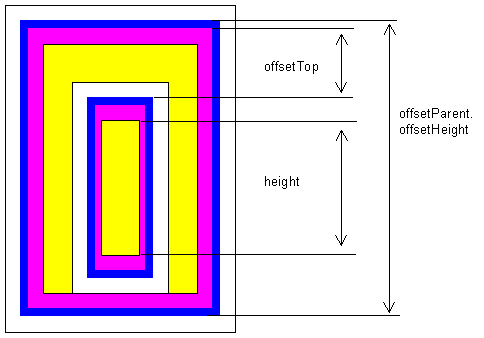
As you can see, the 'height' to be calculated is not only a function of the offsetHeight of the parent and it's own offsetTop, but also of some other paddings, borders, and margins. For the project I was working on it was sufficient to take into account the paddings, so I came up with the following formula (assuming padding to be in pixels):
					height: expression(

						this.offsetParent.offsetHeight -

						this.offsetTop -

						parseInt(this.currentStyle.paddingTop) -

						parseInt(this.currentStyle.paddingBottom) -

						parseInt(this.offsetParent.currentStyle.paddingBottom)

					);
If you have non-empty borders and margins as well, beware that their values may be percentages, the constant 'auto', as well as measurements in other units (em, mm). A complete calculation is actually far from trivial. That's why I did not persue it further. If possible, work with empty margins and borders.
Firefox / Mozilla
I have not found such a simple solution for Firefox. I have not even found anyone that has tried to solve this problem for Firefox. But it may of course be that I didn't look hard enough. That, however lead me to think for a while that the problem could not be solved at all. Did not Firefox perhaps have something similar to "expression"? No, it doesn't. Expression was evaluated but disapproved by the CSS committee. At that point I decided to check the Mozilla site for anything that might be useful. That's when I stumbled upon Mozilla's CSS Extensions. I had used "-moz-opacity" before, but had never checked any of its brothers and sisters. Some of these properties looked promising and these referred to Mozilla's XUL system. They seemed to do something but it was unclear to me how they worked together; so I started looking for examples. I found this extended XUL demo page (viewable with Firefox). And that's where the keymaster met the gatekeeper :)
XUL enters HTML
XUL has two forms of layout that are interesting here: HBOX and VBOX. In an HBOX all elements are ordered horizontally, in a VBOX vertically. You can tell a child element flex='1' and it will flex to fill the rest of its parent's space. You can turn an XHTML element into a VBOX with Mozilla's CSS extensions like this:
					display: -moz-box;

					-moz-box-orient: vertical;
A VBOX can have HBOXes, VBOXes and normal elements as children. Each child element that has the following attribute flexes to fit the parent. Children of an VBOX flex horizontally; children of a HBOX flex vertically.
-moz-box-flex: 1;
If more children flex, and one child flexes 1 and the other flexes 2, the second one will flex twice as much. 0 means: no flex.
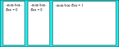
The following picture gives an idea of -moz-box-flex: it is an HBOX with 3 child elements. The last element has its flex property set
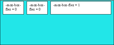
By default, child elements of an HBOX or VBOX also 'flex' in the direction perpendicular to their parent's orientation. This is where the property -moz-box-align comes in. It's default value is stretch, as in the picture just above; but the value may also be (a.o.) start, as in the following example:
Note 1: If you need to place normal XHTML in an HBOX or VBOX, place it in a clean DIV element first. This makes sure the display property is set to 'block'. Add the property -moz-box-flex to flex the div-child in its parent.
Note 2: The display:-moz-box property does not handle whitespace childnodes very well. Sometimes they take up space on the screen, sometimes they don't. On resizing a window containing VBOXes in XHTML, manually, you will see empty lines appearing and disappearing, seemingly randomly. What you can do about this is replacing your code:
					<div id='parent' class='vbox'> <!-- whitespace node here -->

					  <div id='child1'></div>

					  <div id='child2'></div>

					</div>
by the same code without whitespace nodes:
					<div id='parent' class='vbox'><div

					  id='child1'></div><div

					  id='child2'></div></div>
Note 3: These techniques for filling the remaining vertical space can be used to fill up the remaining horizontal space as well.
And the rest of the world
In an attempt to make the page somewhat viewable in "the other browsers" I put some work into making it somewhat acceptable for Opera. Upto this point I had used constructs such as the following to specify that something should be applied only to Firefox:
position: static !important;
At that point I found out that !important is now also gladly accepted by Opera, as are most other CSS hacks available for Firefox. I ended up writing a hack myself, using knowledge of Quirksmode's CSS contents and browser compatibility chart. There is a Mozilla-only CSS extension, ":not()" I used to specify styles for Firefox only.
Closing remarks
This page itself is an example of what is explained in it. Please check the source code. I annotated the CSS to make it as clear as I could.